
How to Create a Compelling Infographic
- Carolyn Riesinger

- Feb 23, 2019
- 3 min read
One area that I have been exploring recently is how bad the fashion industry is for the environment and what sustainable fashion alternatives are available.
Because there is so much data about; how harmful creating garments is, how much they contribute to our waste, and how poorly treated workers in most of the worlds clothing factories are, I decided an easy way to break this information down was to create an infographic.
I began by researching sustainable fashion companies and how they were different from those who did not claim to be focused on sustainability. I found several solid contenders but decided to focus my research on Everlane.

Everlane is a trendy, eco-friendly fashion company that has brick-and-mortar stores in New York and San Francisco, both hot spots for the sustainable fashion trend. The brand also offers all of its products online for customers worldwide to shop.
The company prides itself in being different than other popular clothing brands by using recycled materials, working to completely stop using virgin plastics, and by producing its clothing in factories that treat their workers well.
To create an infographic that would display the shocking statistics of how much the fashion industry contributes to polluting our world, I Googled “textile industry pollution” and found the website CleanClothes.org.
I trusted the information I found on this site because it cited all secondary sources and made it clear where the facts came from.
From this site, I learned that 80 percent of garment workers are female and 60 percent of garment workers in India and Bangladesh have experienced harassment, verbal abuse or physical abuse.
I decided I could use these statistics and juxtapose them with information about what Everlane does to improve the lives of its garment factory workers.
Next, I looked for more shocking facts about how destructive the fashion industry is to the environment. I stumbled upon a documentary called “The True Cost” which exposes the dirty side of fashion production. From this documentary, I learned that 20 percent of industrial water pollution comes from the treating and dyeing of textiles.

Finally, I went to Everlane’s website to learn about what it is doing to change these stats, help heal the environment, and improve the lives of garment workers around the world.
Everlane’s clothing line is made from over 80 percent biodegradable materials and by 2021, the company plans to be completely free of virgin plastics.
To make a compelling and easy-to-read infographic, it is important to be selective about the facts you use and the order you display them in. I chose facts that were extreme and clearly showed a connection to the topic of sustainable fashion.
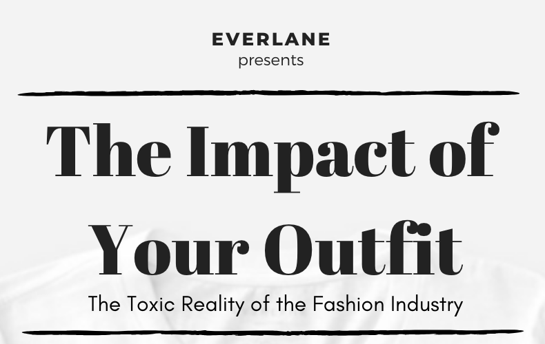
To create my infographic, I used Canva, a design website that makes creating aesthetically pleasing infographics a breeze.

I picked out a clean, white template, wrote a compelling title “The Impact of your Outfit” at the top in a bold font, and began organizing my facts on the page.
Under the title, I put the most shocking facts and then worked my way down the page from right to left, leaving plenty of blank space between elements.
Under the title, I put the most shocking facts and then worked my way down the page from right to left, leaving plenty of blank space between elements.
Adding blank space helps the reader follow the facts and prevents them from getting overwhelmed.
To connect the facts about the fashion industry back with Everlane I ended the infographic with what the company is doing to change the industry.
All persuasive infographics should end with a call to action to tell the reader exactly what they are being asked to do.
In this case, my call to action is “shop sustainably at Everlane and be part of saving the environment.”
Infographics allow you to flex your creative muscles and are one of the best ways to clearly show complicated information. What's something you're passionate about and could create an infographic about?
Images by Vladimir Proskurovskiy on Unsplash, Everlane, "The True Cost", and Canva.


Comments